Get some fun mail! You can order a postcard of art generated from the Algorithm That’s Of the Moment. Your art will be unique, no two postcards will be the same.
Artwork will come from both myself and other artists who have open sourced their projects. The back of each postcard will list the author and technology used to generate the image.
The goal of this project is to share art, and to give people a sense of connection with the work knowing it was generated just for them.
Current ATOM: Twisty Bits
Each art is $2, which covers the cost of printing, postage, and transaction fees. You can expect to get it about a week after ordering.
Postcards will be mailed directly to you, and are at the mercy of the US Postal Service.
If you’d like something that is more display-worthy there are additional options for higher quality versions mailed to you in nice protective packaging.
Silver Halide Print – a fancy way of saying photo. Same dimensions (6×4), same artwork, but printed on a photo printer and mailed in a protective envelope. Downside: no printing on the back telling you what the heck it is.
Giclée Gallery Board Print – One 6×6 inch archival quality print mounted on thick gallery board, ready to display. I’m happy to hand-tweak these to match any color scheme you like, just leave a note at checkout or email me.
Personally generated art
Answers to questions no one has actually asked
Can you notify me of new ATOMs?
Yes, fill out this form
Can I see what the ATOM looks like before ordering?
No.
Can I order something from a previous ATOM?
No. Well, probably not. I’m not saying I’ll never resurrect an old one but in general no. If you really want an old one email me and plead your case.
What if I don’t like my art?
It was $2, you’ll be OK.
I lost my art, can I get another copy of it?
Probably not. Well, maybe. But probably not. I can’t re-generate the same image. However when your print is originally generated the image is saved on the server for a brief period of time. It is possible it’s still lingering around, email me and I can check.
I think this is cool, how can I help?
Tell your friends! Or if you like making generative art email me about offering up your work here.
I use a Google Voice number for business and one thing I really miss is having a physical phone that literally rings. It sucks to miss important business calls because I left my phone in the car or on mute or otherwise can’t be trusted to keep track of the damned thing. My Voice number rings through to my cell, and I can pick it up via Google Hangouts if I happen to be sitting at my computer, but what I really wanted was an honest to god phone. And so I got one!
The phone I got is a vintage-style brand new boring old analog telephone. It will work with any landline, and if I had one of those I could just forward my Google Voice number there and call (ha!) it a day. But I don’t have a landline. So I set up my own little pbx phone system to connect the phone to the internet.
The basic process is to get an adapter to connect our phone to our home network and then set up some software to connect that network to Google Voice.
Installing the Analog Telephone Adapter
The analog telephone adapter (ATA) connects your dumb old phone to your network. I bought a Grandstream Handytone 701 off Amazon. The software isn’t quite as nice as the Linksys/Cisco that’s popular, but it was cheap and you really only have to deal with the software when you’re setting it up.
The ATA needs to be connected to both your phone (via a normal phone cord) and the internet (via an ethernet cable to your router). My house is wired for ethernet but you can also use a powerline ethernet adapter to bring your home network from wherever you keep your router to wherever you want your phone.
Once you hook it all up and lift the receiver you’ll get a dialtone! Magic! And then if you dial a number… nothing will happen! Great! The software in the ATA needs to be configured to use your Google Voice SIP trunk.
Getting Google Voice Set Up as an SIP Trunk
There are a bunch of different ways to get Google Voice to interface with a phone system, but by far the easiest option is to just pay Simonics $5 (one time). The benefit of using them is that it’s easy and cheap. The downside is if they ever go out of business or stop providing the service I will be out $5. After spending multiple hours trying to get Google Voice to authenticate on a traditional Asterisk server it’s a risk I’m willing to take. SIP is a voice over internet (VoIP) protocol.
If you are dead set on not spending $5, check the PBX In A Flash community forums for the latest on setting up Google Voice as a SIP Trunk.
Once that’s set up you can test it using any software SIP phone. I use X-Lite on my PC.
Configuring the Grandstream Handytone ATA for Google Voice via Simonics
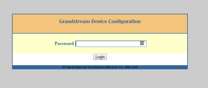
The next step is to find the IP address of the ATA. You do this by picking up the phone, pressing * * * and then pressing 0 2. A robot will read off the IP address to you. It’s sort of surreal honestly. After you pop that IP address into a web browser you’ll get a login page like this:
The default password is ‘admin’
Once you log in you can see we have a pretty ugly GUI. But we didn’t buy this thing for its incredible interface design. Once you’re logged in click the tab that says FXS port. In another browser window log in to Simonics and fill out the ATA settings with the following info:
Primary SIP Server: [Server (something like gvgw.simonics.com)]
SIP User ID: [SIP Login/prefix]
Authenticate ID: [SIP Login/prefix]
Authenticate Password: [SIP Password]
You can leave everything else blank. Make sure that your Google Voice Account status at Simonics says “Online” and you should be good to go. Hit “Apply” at the bottom of the page.
If all went well you should see “Registered” in the registration column for the FXS port.
Making it more fancy
If you like messing around with stuff you can set up an Asterisk server on a RaspberryPi and do all sorts of fun things like have it automatically go straight to voicemail at night, use different ring patterns for different numbers, set up an infuriating phone tree for people to argue with… the list goes on. For me though just having the stupid thing ring is all I really need.
“Are Gigi and Pop Pop awake yet?” -My 3 year old, every 5 minutes, all morning
We have a shore house that is next door to that of my in-laws (who are called Gigi and Pop Pop by my preschooler). This is wonderful for a myriad of reasons, and from the moment the kiddo wakes up she has exactly one thing on her mind: “when can I go next door to Gigi and Pop Pop’s?”
A simple solution for answering this question would be some sort of visual signal, like opening the blinds or a little flag or something. Unfortunately we don’t have any windows on the side of the houses that face each other, so I decided to rig up the most technologically complicated solution possible.
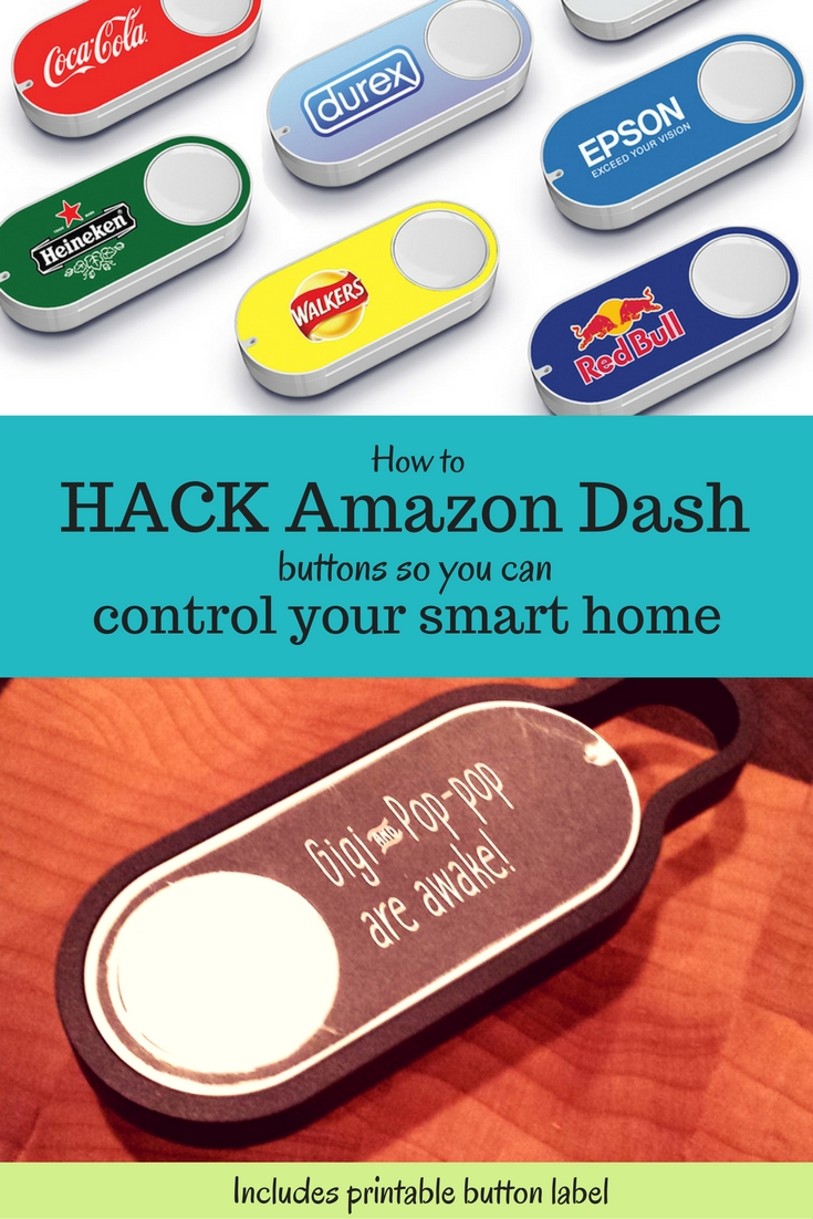
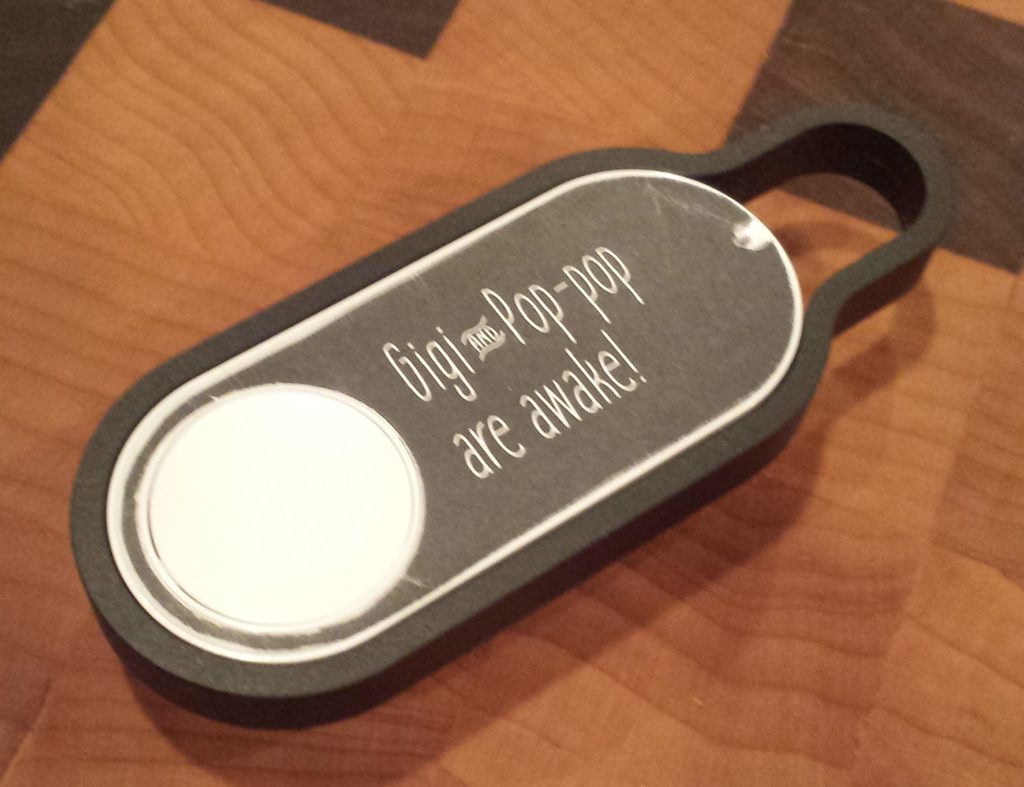
Amazon Dash button with custom label
Before we continue: if you’d like to emulate this solution but aren’t particularly technical, don’t have a fancy router, or just don’t want to spend a day+ dicking around with things, I suggest just buying a LIFX wifi bulb and a flic button. You can use IFTTT to link them, for a total of $75 and an hour of your time. If you want to spend the better part of a day cursing at things just because you can, or you’re just looking for something to do with your RaspberryPi, read on!
Amazon’s Dash button is meant for you to reorder toilet paper. At $5 it’s also an extremely cheap wifi button. Of course, pressing it does just one thing, and that thing costs you money, but with a little bit of effort we can hijack those requests for our own devious purposes. Sorry Amazon. I might feel bad if I didn’t already spend thousands of dollars a year with you.
Most of the work was already done for me in this reddit thread. The first step is to set up a server to handle traffic from the button. I’m using a RaspberryPi running Raspbian (which I already had). Python was already installed with the OS, but I had to add a few more tools to get where I want.
First, I installed pip to make installing the other python libraries brain-dead.
Then I installed lifxlan, a library for controlling LIFX lightbulbs locally, and scapy, a packet sniffing library.
I set up the Dash using the Amazon app, giving it my network credentials, and then closed the app when it asked me to pick an item to purchase. It complained that my progress wouldn’t be saved, which was fine.
When you press the button the Dash will connect to your LAN. If you’re quick you can probably find its MAC address in the client list on your router (Status > LAN > Active Clients on DD-WRT). I’m not so I used Ted Benson’s python script to find the MAC address.
Of course when the button is pressed it also phones home to Amazon, and then Amazon sends a notification to my phone reminding me to pick something to buy. While this doesn’t trigger a purchase, it’s still annoying. At first I just blocked the button from WAN access using a MAC address filter on my router. But then it stayed on longer, draining the battery. In order to save the non-replaceable battery life I set up a DNS entry on my router that redirects all of the requests to the button’s home server (parker-gateway-na.amazon.com) to my RaspberryPi. The easiest way to do this in DD-WRT is to add the following lines to the startup script (under Administration > Console)
Now the Dash button connects to the LAN, sends a request to my RaspberryPi (which is ignored), and then shuts down.
Tying it all together
Using more of Ted Benson’s code we listen for the ARP packet the button sends when it connects and use that to trigger a LIFX event. In my case I have a specific light bulb I want to turn blue so I figured out that bulb’s MAC address and then filter the list of bulbs against that. The lifxlan library in its current form doesn’t let you select a single bulb very easily, and if I can brush up on my python I may look into forking/extending it to do so.
I also have my script set to leave the bulb on/blue when it’s done, because I want it to stay that way until I manually reset it, but obviously you might want to read the initial bulb settings and reset them when you’re done blinking.
Making a cute label
I whipped up a really quick sticker to cover the button, printed it on sticker paper and and cut it out with an xacto knife. Download it here if you’re so inclined.
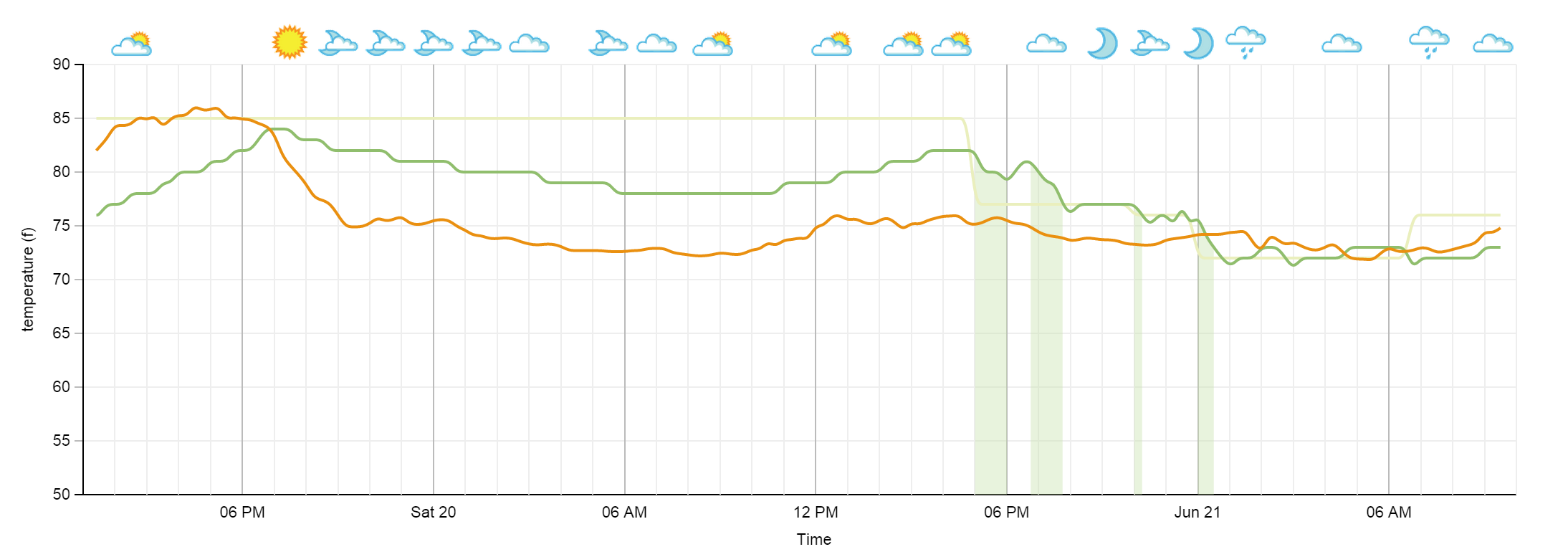
We got a Nest thermostat and I spent the better part of a couple days working on logging and displaying the data. I used the Nest API for thermostat information, Weather Underground API for weather information, MongoDB for storage, and D3 for visualization. There’s also a little PHP glue in there which I plan on replacing with something else (probably node.js).
Nest Temperature Log
The system is currently in cooling mode. The green line is inside temperature, the orange line is outside temperature, the pale green is the target temperature, and the green shaded areas represent times when the system was cooling.
Every 15 minutes the script hits both Weather Underground and Nest. Right now I just throw the whole response tree into Mongo so I can decide later what I want to use.
This is the first time I’ve used both D3 and Mongo so the code isn’t very clean or pretty. I’ll put it on github once I’ve had a chance to organize it a bit better. I’m still struggling with formatting the time labels the way I want.
The weather icons are from Weather Underground and only appear when the weather conditions change. However while the URLs for ‘partly sunny’ and ‘partly cloudy’ are different the icons are the same so there are still some repeats.
Further improvements I’d like to add include a legend,humidity data, the ability to zoom/pan through the data, and the ability to show/hide some of the lines.
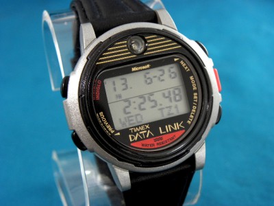
I have been into geeky watches for a very long time. In high school I sported one of these bad boys:
Timex Datalink
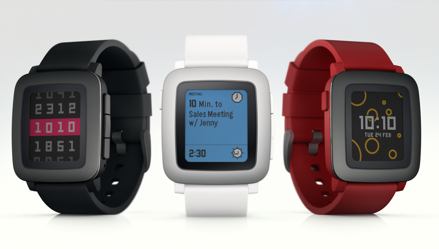
I have a red Pebble smartwatch and love it. I’ve been following the Apple Watch hubub and laughing, because the 18-hour battery life is a joke and my Pebble gets a week. I figured Pebble would have some sort of response to the Apple Watch, and they did: Pebble Time.
Meh.
If we cruise past the fact that it is larger and uglier than the existing Pebble watch (which is enough to stop many people right there), here’s my main problem with the Pebble Time: I really don’t need a color watch face.
I have installed and uninstalled many Pebble apps over the last year. The things I actually want my watch to do include:
telling the time
seeing the name of a caller so I can decide whether to dig my phone out of my purse
seeing text messages without digging my phone out of my purse
seeing calls/text messages when I left my phone downstairs
tracking my run time/distance
using a stopwatch/intervalometer when working out
You’ll notice there’s not a lot on this list. Two of the items are covered by your standard Timex Ironman watch. Among the things I have uninstalled are games, weather, photo galleries, yelp, and other widgets that I ultimately decided just don’t belong on a watch. It’s bad enough to look like a dickhead messing with your phone all the time. Squinting into your wrist and hitting buttons doesn’t look any cooler, I assure you. I use my watch for things I can glance at and make a decision. I don’t generally want to interact with it.
I think the form factor is also a huge deal for a segment of the tech-loving population that has been neglected time and time again by wearable tech: women. I’m not saying this because the watch is “too techy” or “not pink enough” for ladies. I’m saying this because it’s fucking huge and on average women have smaller wrists than men.
My Pebble is no less awkward on my wrist than my Datalink was in 1999 and that thing was a standalone pager (oh, turn of the century tech). The Pebble watchface itself is literally taller than my wrist is wide. It takes a certain commitment to tech and discomfort to be willing to wear one of these things as a small-wristed person.
So here’s hoping Pebble’s next iteration is a watch that will actually fit on my wrist, instead of a bunch of features I don’t need in a watch.
Logging another one of my “weird wordpress problems” here.
We use a plugin called Buddypress Private Checklist to offer wedding to-do lists to our members on the Offbeat Bride Tribe. It was written many years ago by our old developer, and I’ve been vaguely maintaining it in our open source plugin repo on git. But it was a hack when it was written (old dev’s words, not mine!) and we’ve grown a lot over the years. It’s in need of a major upgrade, and the first item on my docket was the fact that it takes forever to load the initial default tasks into a to-do list.
The initial task loader takes a CSV full of default tasks and inserts them as posts into the Worpdress database. We have 124 tasks and it was taking five minutes. I expect a loop of 124 inserts to be a little slow, but five minutes is insane.
The posts, which are a custom post type, also use custom taxonomies to organize them. When I disabled the taxonomy inserts, done with wp_set_object_terms(), everything ran quickly. When I tried the plugin on a fresh install it ran quickly even with the taxonomy information. Disabling all plugins and going to the default theme didn’t change anything. I finally put together a test page that just looped through a bunch of post and taxonomy inserts, and watched it with Query Monitor.
After every new taxonomy term is inserted, wordpress runs wp_update_term_count(). On something the size of a personal blog this is not a big deal. On a community with 40,000 posts and 900 tags, this takes maybe half a second. Doing that 124 times takes forever. Thankfully there is a way to disable this excessive recounting, wp_defer_term_counting().
function insert_many_posts(){
  wp_defer_term_counting(true);
  $tasks = get_default_tasks();
  for ($tasks as $task){
     $post = array(
       'post_title' => $task[content],
       'post_author' => $current_user->ID,
       'post_content' => '',
       'post_type' => 'bpc_default_task',
       'post_status' => 'publish'
     );
     $task_id = wp_insert_post( $post );

     if ( $task[category] )
        //Make sure we're passing an int as the term so it isn't mistaken for a slug
        wp_set_object_terms( $task_id, array( intval( $category ) ), 'bpc_category' );
  }
}
Now the whole loop takes about 10 seconds. Hooray!
Thanks to some help from my friend Will and someone on StackOverflow I’m finally able to run stats by corral.
Let’s start with the Half Marathon and Full Marathon. Those had the same number of corrals (16) whereas the 10K only had 6.
I started by calculating the median finishing time per corral. I was surprised to see that the last corral had a slightly faster median than the one before it. I suspect that this is because people without a previous qualifying time were put in the last corral, so folks who are more serious runners who are running their first Half Marathon might have been stuck back there. There was also a huge group of A runners who came in dead last, I expect these were course sweepers or other specifically paced volunteers.
Pace is in minutes per mile.
Half Marathon
Full Marathon
Corral
Median Time
Pace
# Runners
Median Time
Pace
# Runners
A
1:42:26
7:49
508
3:38:53
8:21
519
B
1:47:07
8:11
336
3:41:49
8:27
373
C
1:56:18
8:52
656
3:58:14
9:05
704
D
2:02:47
9:22
722
4:10:45
9:34
758
E
2:06:45
9:40
755
4:24:55
10:06
767
F
2:15:03
10:18
1148
4:39:07
10:39
1138
G
2:19:49
10:40
1217
4:46:08
10:55
1223
H
2:28:57
11:22
1244
5:04:03
11:36
1172
I
2:36:08
11:55
1583
5:17:01
12:06
1518
J
2:44:10
12:31
1770
5:33:52
12:44
1737
K
2:53:51
13:16
1743
5:50:05
13:21
1613
L
3:02:28
13:55
1952
6:09:21
14:05
1948
M
3:06:32
14:14
1679
6:22:16
14:35
1509
N
3:11:19
14:36
2064
6:40:29
15:17
1704
O
3:13:17
14:45
1942
6:31:38
14:56
1440
P
2:54:27
13:19
2781
5:46:36
13:13
1864
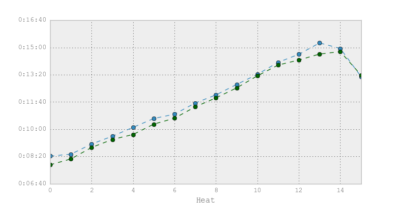
I thought it was interesting how close the median pace for each corral, despite the full marathon being twice as long. This poorly labeled graph shows the median pace for each heat. The heats have numbers instead of letters because I am not good at matplotlib.pyplot
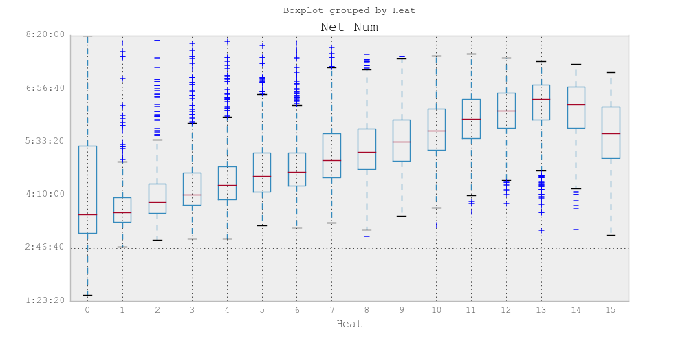
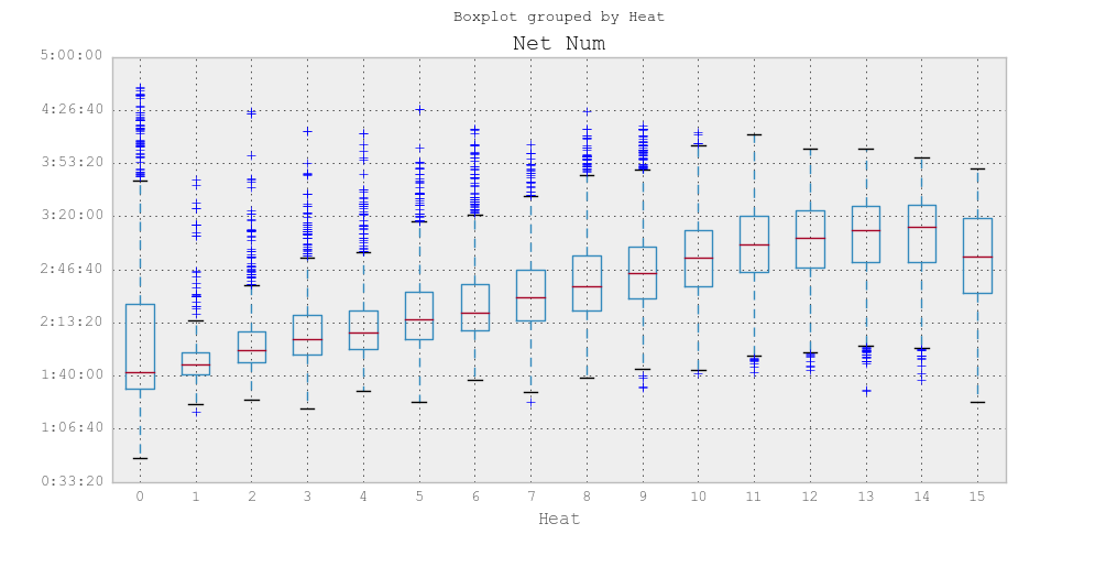
Next we have a boxplot of finishing times grouped by heat.
Full Marathon finishing times by heat
Half marathon finishing times by heat
From this we can see that there are quite a few runners in heats 0-9 (corrals A through I) who should have been in a slower heat. Those in the slowest 25% of each heat came in later than the median of the next slowest heat. The runners outside the caps are outliers, meaning the algorithm decided those runners statistically did not belong in that heat. Even if we ignore heat A, which has a bunch of pace teams in it, there are clearly a bunch of people who were a bit optimistic with their corral placement. Likewise we see folks in the back corrals who will hopefully get better placement next time.
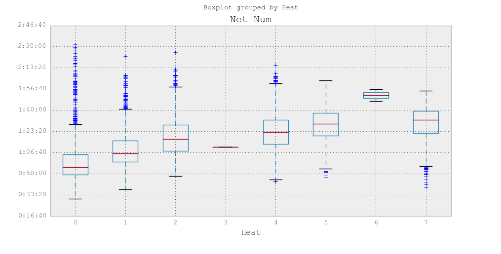
I had a little trouble breaking the heats out on the 10K (not sure what’s up with 4 and 7, those shouldn’t be there) but you can get the general idea. Corrals ABCDEF are heats 0 1 2 3 5 6 8 respectively.
Ten K time by corral
Looking at these graphs I can gauge whether my friends and family were in an appropriate corral or not.
Chris: in corral B/1 for the half, finished in 1:47. Seems spot on.
Kate: in corral J/9 for the half, finished in 2:33. Also looks right.
Lorena: in corral P/15 for the half as she didn’t have a prior qualifying time. Finished in 2:03. E would have been more appropriate.
Matt: in corral O for the full. Finished in 4:29. E or F would have been more appropriate.
Dustyn: in corral D for the 10k. Finished in 1:03. B would have been more appropriate.
Me: In corral E for the 10k. Finished in 1:04. B would have been more appropriate.
So why does any of this even matter?
I believe strongly that running should be for everyone. I don’t really understand the people who run long distance race at a 16:00 pace, but it’s still an accomplishment. That said if you run for time it is extremely frustrating to get placed in a late corral and have to dodge walkers during the race. Likewise I’m sure it’s frustrating to have fast runners diving in front of you if you’re walking in the back of the pack. Appropriate corral placement is key to everyone enjoying themselves.
Based on this I suggest the following:
If you run for time, make sure you run a qualifying race (if needed) ahead of time so you can get into an appropriate corral. If your race lets you self-report your expected time, give yourself some credit. When I signed up for the race I was running at a 12 minute pace, but was closer to a 10 by the time I finished training.
If you don’t run for time, be honest. Don’t submit a time that puts you in the B corral if you have no intention of running that time.
If you’re a new runner and want to run a friendly race where you won’t come in dead last, run a Disney race. Even if you do come in dead last, you’ll have plenty of company.
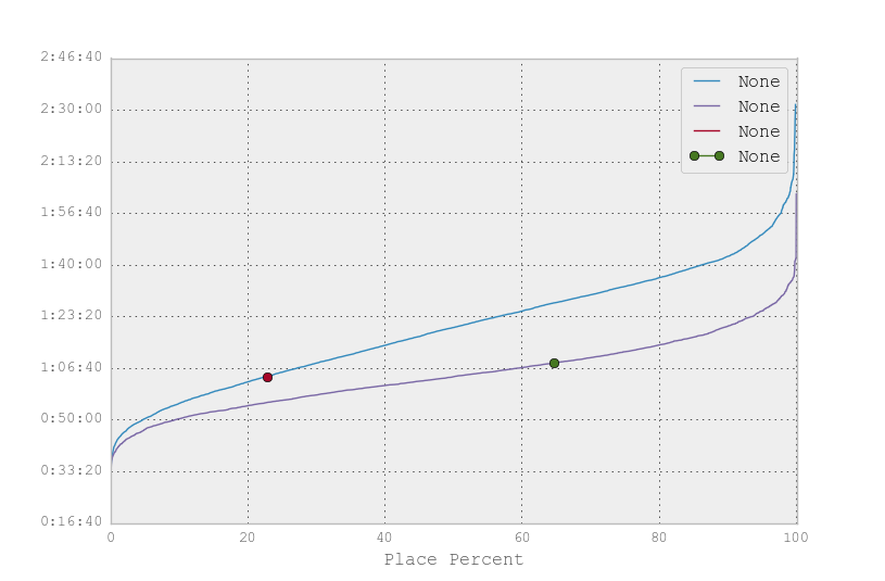
Before I wrap this up I have one more graph to show: a comparison of the finishing times at the Disney 10K vs the Philly 10k. I ran both, and came in about 6 minutes faster in the Disney 10k. Philly is purple, Disney is blue, and the dots are me. There were a different number of runners in the two races so I scaled them to match. The x axis shows place/total*100, which may or may not be the same as a percentile I’m not sure. I don’t think it is.
Conclusion: Disney races are slower than my local race. A time that puts you in the top 1/3rd at Disney has you in the bottom 1/3rd in Philly.
I’m about stats’d out, but the data is on github if anyone wants to play with it themselves. You’ll need to edit the scripts to work on your system, I just chucked them into git so they have file paths for my filesystem in them (and now you can all see that I run Windows).
So my stats / python skills haven’t greatly improved in the last 48 hours, but I did manage to find some fun new ways of displaying the data I already have from the 2015 Walt Disney World Marathon Weekend.
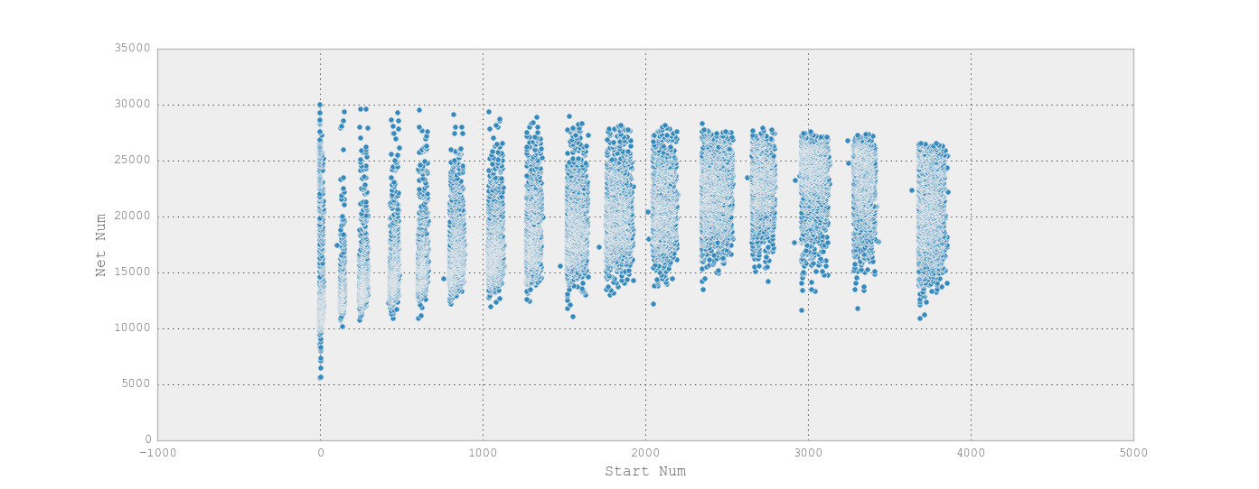
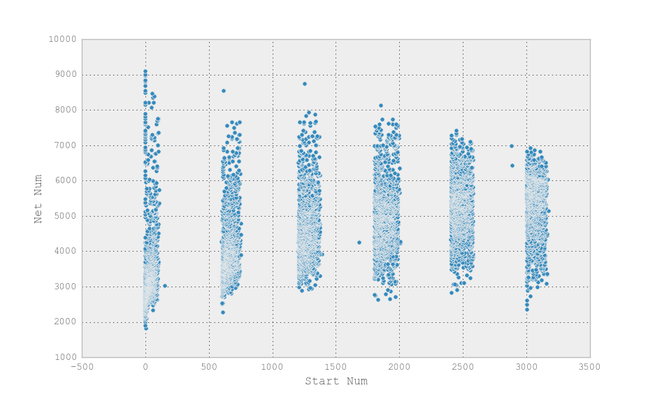
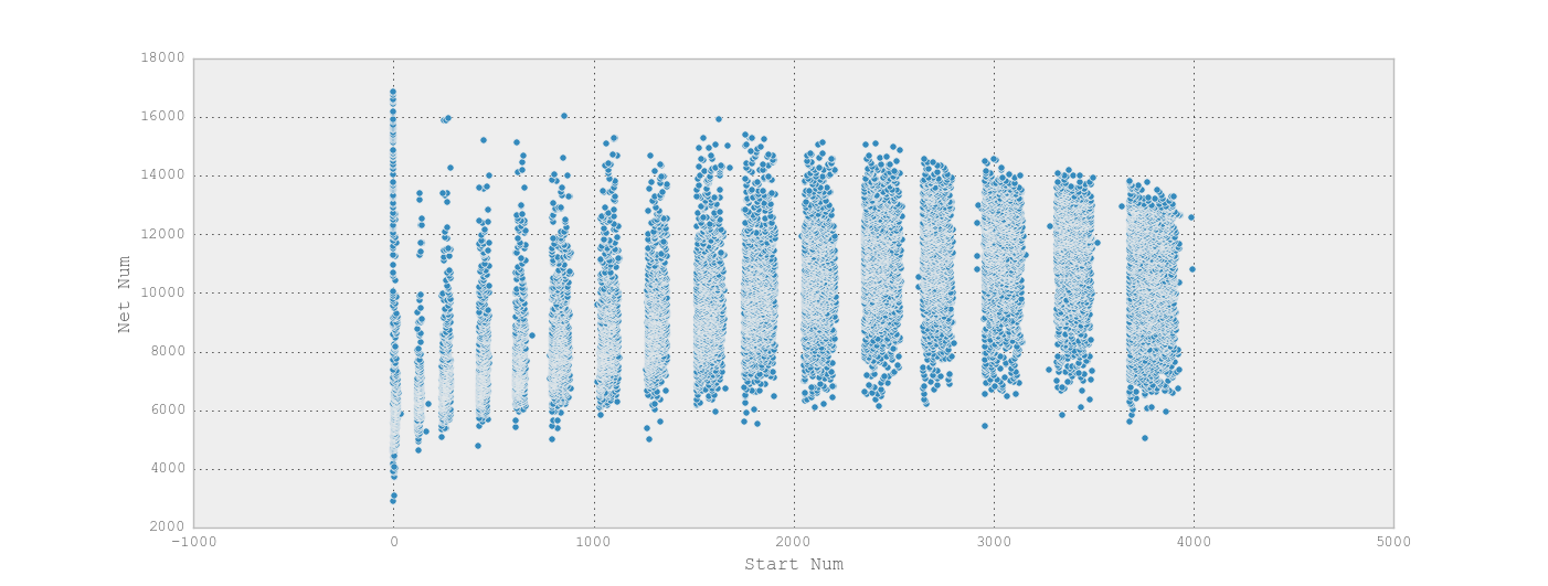
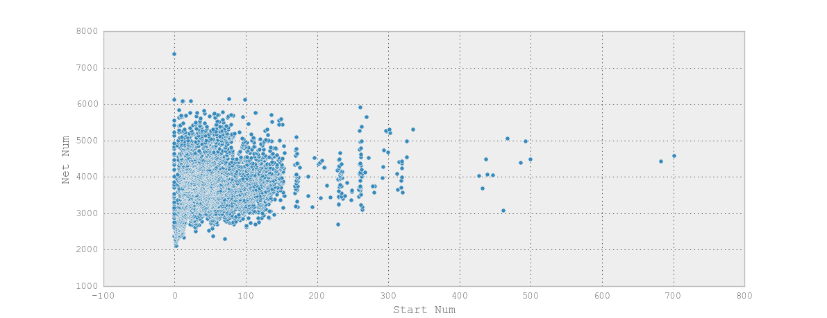
I’m trying to break up the racers into their heats (aka corrals) and while I’m having trouble doing that in a way that Python can “see” I found that a scatter plot makes it really obvious to the human eye what the corrals are.
On the X axis I graphed start time and on the Y I graphed net finishing time.
Here’s the Disney World 10k with its 6 corrals
The full and the half, each with 16
And by comparison, the Philly 10k which technically had corrals but didn’t make much effort to space them out
You’ll notice in the Disney races have the widest range of times in the first corral. Some of this is probably people overestimating themselves (particularly for the 10k which doesn’t verify qualifying times) but I believe a fair number of them are race volunteers / staff who are maintaining a particular pace to warn people who are about to be swept. From what I’ve read there are folks who place little warning flags on the mile markers to let people know they’re in danger of falling behind the required 16 minute pace.
Four of my family members and three of my friends ran races during the Walt Disney World Marathon Weekend this past week(end). Three of us felt correctly placed in our starting corrals, three of us felt the race was more of an obstacle course of slow-moving people. I started wondering about race stats and while I’m still sorting through them (and brushing off my rusty python skills) I did manage to come up with some fun histograms.
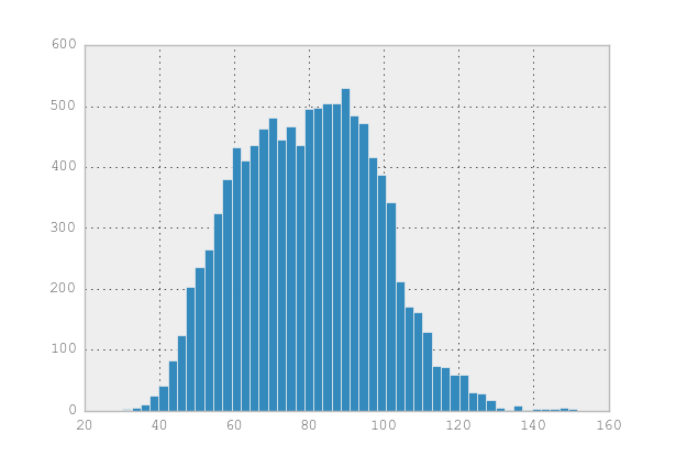
First we have the 10k, which was my race. I finished in 1:03:58, or about 64 minutes. Since I haven’t figured out how to control the labels on my graphs they’re just listed in minutes. My time, which is not a particularly exciting time to most runners, is surprisingly early in the graph. There’s also an interesting jump at 90 minutes. Keep in mind these are net times, not clock times, so even folks who started late but ran fast should be competitive here.
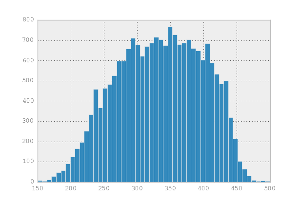
Next is the half marathon. There’s an interesting drop at 3 hours. The pace cutoff for all the races was 16:00 (and wasn’t strongly enforced) which would be a 3:30 half marathon. I’m not sure what caused the huge drop at 3 hours.Last we have the full marathon – 26.2 miles. I’m actually surprised there isn’t a longer tail on this graph given how many folks were walking and otherwise going slowly. I’d love to compare the shape of the histogram to other more serious runs, but those don’t have such easy-to-scrape data so it may be a while.
I’ll post more on the stats process as I work on them, but it may be a while since I’m on vacation (woo!)
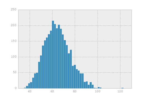
Edit: Here’s the histogram for the Philly 10k in September. It’s a very different shape (and was also a much smaller race)
I woke up this morning to a fresh new problem at work: Wordpres was truncating image captions. Specifically, we have a lot of old content (dating back to 2007!) and therefore old shortcodes, and the old style caption codes (which use caption as an attribute) were getting truncated. They were also showing their opening quote. It was ugly, and it was confusing because I hadn’t touched the server at all in about a week.
I initially suspected an errant plugin, because that’s the cause of 90% of my pain in WordPress. Last night I’d spun up a staging server from a backup, so I had a <24 hour old copy of the server. Our databases are on a separate machine so I refreshed the dev database too.
Irritatingly, everything worked fine on dev. To figure out what was different between the two servers I use rsync (from within the web directory on the dev box)
The -n flag is key because it does a dry run rather than actually copying the files
Among other things, wp-includes/version.php was different. Turns out a security update had been applied automatically (taking us from 3.9.2 to 3.9.3). I updated us to 4.0.1 (uh, yeah been meaning to do that …) and everything was fixed.