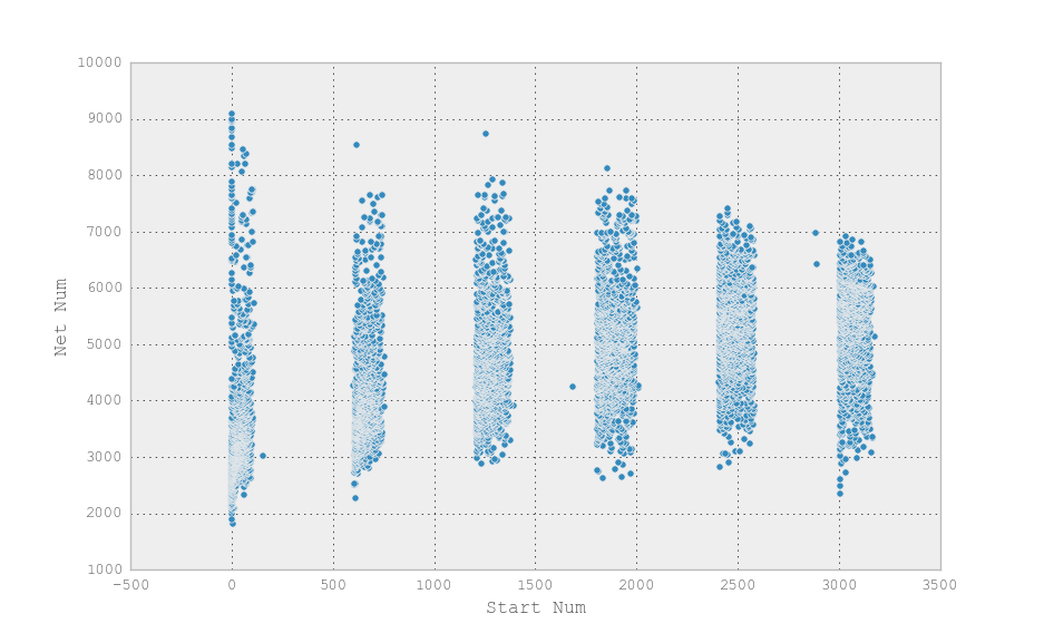
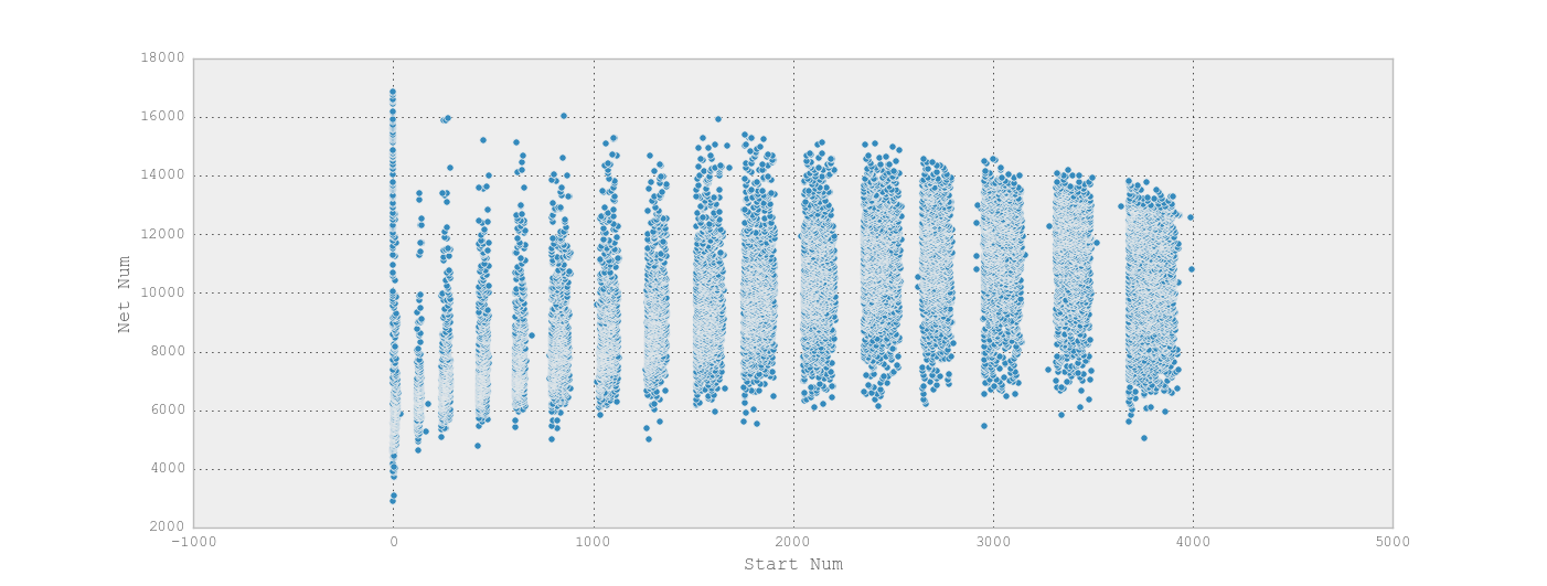
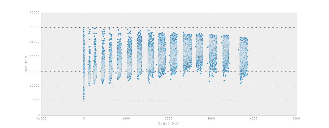
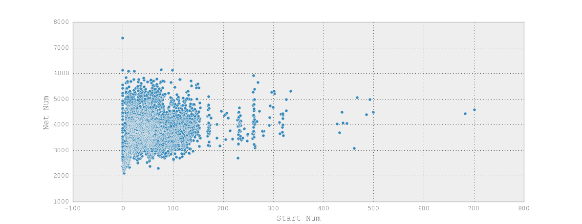
So my stats / python skills haven’t greatly improved in the last 48 hours, but I did manage to find some fun new ways of displaying the data I already have from the 2015 Walt Disney World Marathon Weekend.
I’m trying to break up the racers into their heats (aka corrals) and while I’m having trouble doing that in a way that Python can “see” I found that a scatter plot makes it really obvious to the human eye what the corrals are.
On the X axis I graphed start time and on the Y I graphed net finishing time.
Here’s the Disney World 10k with its 6 corrals
The full and the half, each with 16
And by comparison, the Philly 10k which technically had corrals but didn’t make much effort to space them out
You’ll notice in the Disney races have the widest range of times in the first corral. Some of this is probably people overestimating themselves (particularly for the 10k which doesn’t verify qualifying times) but I believe a fair number of them are race volunteers / staff who are maintaining a particular pace to warn people who are about to be swept. From what I’ve read there are folks who place little warning flags on the mile markers to let people know they’re in danger of falling behind the required 16 minute pace.